

Before the end of 2024, we’ll be launching a new writing app on macOS, Windows and iOS. We’re now putting the call out for beta testers. Read on if you’d like to learn more and participate.
Let’s Talk About Text
Writing something you intend to share with readers involves a certain dilemma. On the one hand, while writing, you need to focus on the content—worrying about formatting can be a distraction at this stage. On the other hand, formatting is important, whether you’re self-publishing or submitting a manuscript to an editor, and putting it off until the end of the process can create more work later.
So how do we balance composition with presentation?
When it comes to the relationship between the two, most writing apps fall into one of two categories: “rich text” and “plain text”. Each has its advantages and disadvantages.
Rich Text
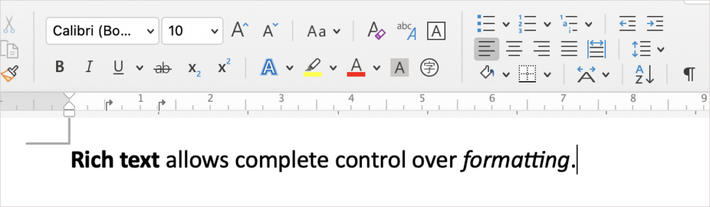
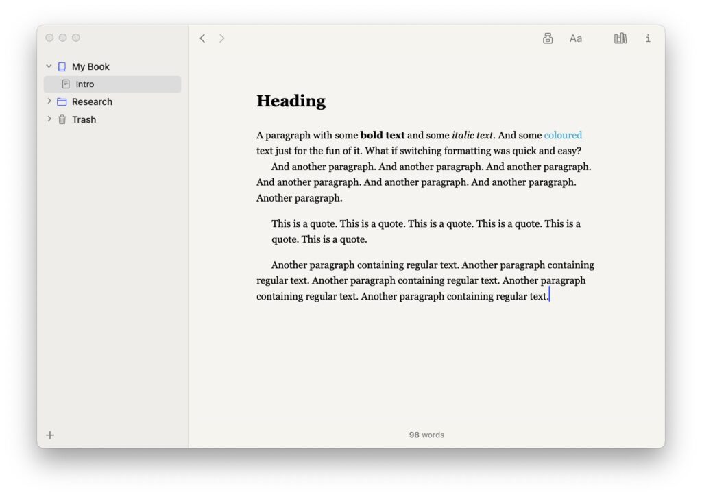
Word processors such as Word use rich text: they give you complete control over all formatting right there in the editor. On the upside, this means your text looks great while you’re writing and you know exactly how it will look on the page. On the downside, all that control requires a lot of UI: a ruler for tabs and indents, buttons for bold, italics, and alignment, menus for line spacing, and so on.
Rich text can also be somewhat inflexible if you need to share the text in different forms. While it might allow you to write using your favourite settings—blown up to 96-point Futura, say, or bold Comic Sans—all that formatting is baked into the text, so changing it later to something more suitable for your readers can be time-consuming; even more so if you need different formatting for, say, proof-reading and publishing.1
Plain Text
In the opposite corner of the ring we find plain text editors that use Markdown. Plain text contains no formatting at all. This means fewer distractions while writing and, with no need of formatting buttons, allows for a more minimal interface. (This can be especially handy on mobile apps, where UI real estate is at a premium.)
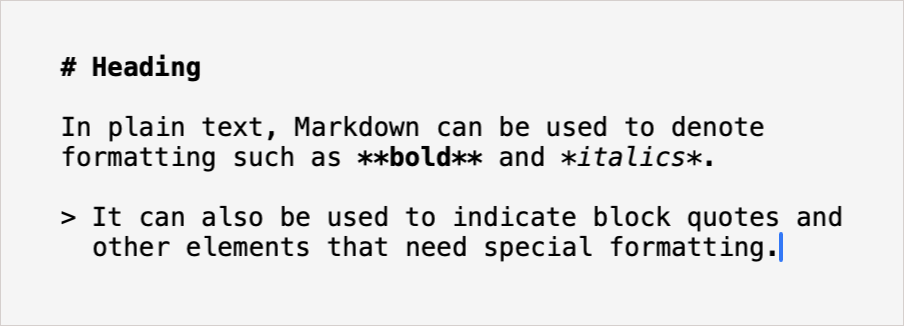
The downside is that you still need some way of telling the app how the final document should look, which is where Markdown comes in—you “mark” the text with symbols that act as placeholders for the formatting. To indicate a section of bold text, you wrap it in asterisks, **like this**; to indicate a block quote, you start each line with a “>”.2
Aside from needing fewer buttons, the advantage of this approach is that the text isn’t associated with any specific appearance (line spacing, font settings). Instead, users choose an appearance to be applied to the exported or printed document, and can often choose different appearances for different purposes (ebook, PDF, etc).3
This approach has plenty of adherents, but personally I find symbols in the text while I’m writing more distracting than formatting buttons.
Cake Text?
Is there a way of having our cake and eating it? A text system that incorporates the advantages of both approaches? Rich text that still looks beautiful while writing, but without the necessity of so many buttons, with content mostly divorced from appearance, making it simple to switch between different sets of formatting?
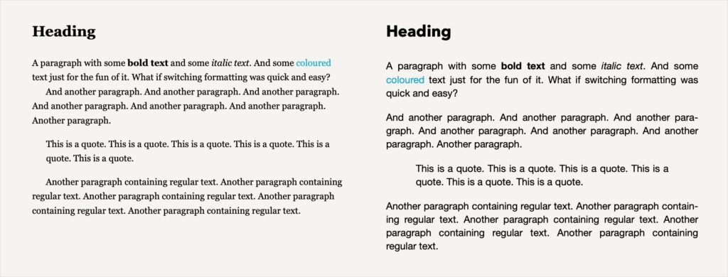
When it comes to reading, this isn’t uncommon: many e-readers, for example, are “rich text” in appearance (featuring bold text, indented quotes and so on) but let the user switch between various font and line spacing options that alter the presentation of the entire book on the fly.
This works because the text itself only knows that this paragraph is a title, those paragraphs are a quote, and these words are bold—it doesn’t know the formatting specifics. Those specifics are applied using a “style sheet”, which tells the text to, say, use a 12pt Sabon font with 1.2 line spacing, make titles bigger, and indent quotes. Switch to a different style sheet and the whole book looks different.
We think that with some tweaking, a similar approach could work beautifully for prose writing too, allowing for versatile formatting with fewer distractions. Which is why I set about coding a new text system based on these ideas. This was the starting point for our new app, which has been in the works now for nearly three years.
This Isn’t Scrivener
With a more minimal text system came the opportunity for an app with a more minimal interface, something that could be much the same on desktop and mobile devices.
We asked ourselves, would this be Scrivener 4? The answer was a resounding no. No one liked the idea of making Scrivener more minimal (except perhaps me, but only for selfish code maintenance reasons). That would mean tearing out features—and by what criteria?
I created Scrivener around a fairly small set of features that I consider “core”. But from discussions among the team and from the 2020 user survey, we know that the features users consider “core” differ greatly.
Scrivener has always been inclusive: its ability to handle so many different writing tasks and its vast array of tools are why so many users love it. It’s why we love it. Making Scrivener more minimal wasn’t an option. No one’s favourite feature should have to face the chopping block, especially when there are no real alternatives out there that do all that Scrivener does. When we eventually start thinking about Scrivener 4, then, it should remain inclusive; our more minimal writing app would need to be something different.
Not Scrivener then: something new. But not entirely new. I’d long been toying with the idea of an alternative, more minimal take on Scrivener. This was a chance to create an app pared back to hone in on the principles on which Scrivener was originally built:
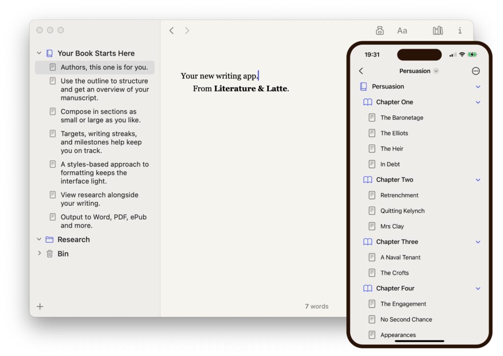
- Work on a long text by splitting it into smaller sections.
- Use an integrated outline for an overview and easy restructuring.
- View research alongside writing.
- Export or print with the option of changing the document’s appearance.
No corkboard, no scriptwriting mode, no distinction between titles and synopses, no collections, no multi-column outline, no custom metadata.
Instead, a pure concentration of writing and structure: an outline containing titles or descriptions tied to sections of text, a clean space to write, a place for notes, and an area to refer to research if you need it.
Such a laser-like focus keeps the UI light while still delivering a powerful writing experience tailored for long texts.
So this isn’t Scrivener; it contains only a fraction of Scrivener’s features, and that fraction often works differently. It’s a scalpel to Scrivener’s Swiss army knife. And because it uses a different text system (and thus a different file format) and steers its own course, this isn’t a “Scrivener Lite”, either. It is its own thing. (Its own thing with iCloud sync.)
Those who rely on Scrivener’s deep feature set may find our new app too limiting, and that’s fine—Scrivener will continue to be the powerhouse writing app it’s always been. It’s just being joined by a new member in our family of writing apps.
But for those who use Scrivener mainly for the core principles above, or those who like the idea of Scrivener but find it too much for their needs—our new app might be right up your street.
We Need You
We’re now at the stage where we need to open up the macOS and iOS versions to a pool of testers. We’re also looking for Windows testers to register interest for when the Windows beta is ready sometime in the first quarter of 2024.
If any of the above strikes a chord, follow the link below to sign up for beta testing.
Register to Become a Beta Tester
(Please note that this is a private beta, so if you’re selected from the waiting list, you will be asked to keep quiet about the app until we say. You’ll also need to be active in reporting issues.)
That’s all we’re saying and showing for now. We’ll have plenty more to say at some point next year, when beta testing nears completion and we can start thinking about the launch.
Until then, happy writing—whether in Scrivener or in the beta of our new app.
1 Scrivener solves this problem by allowing formatting to be overridden when printing or exporting.
2 Technically Markdown symbols are more about semantics than formatting, and double asterisks denote “strong” rather than bold, but this simplified description will suffice for our purposes.
3 Again, Scrivener’s “Compile” feature achieves something similar by overriding formatting on export or print.