Once we get Scrivener through another release cycle the plan is to look at Scapple again, but I can’t say when that will be as there are two pretty large variables in that equations—I’d also stress as before that I can’t say this feature will ever make the cut. It’s the sort of “fiddly” thing the software was designed to avoid, so really it depends upon whether an implementation that stays out of the way can be found that makes sense.
It might be “fiddly” from a developer’s viewpoint, but I feel it is important from my user’s viewpoint as it would make my diagrams much more obvious and easier to read when connection lines go directly to their destinations and do not disappear behind other nodes.
Do you have a means for users to make comments on the changes that could be included in the next version?
As for the rest, I haven’t made myself clear: it was the user interface that was inelegant and fiddly, that is why it was removed. I’m not speaking from a standpoint of the source code, but how you would have had to have used the feature if we had left it in. It wasn’t adding enough to the overall design, and not achieving the goals you desire, to merit the added complexity to the interface.
You’re already speaking with the right person for that. ![]() I have this stuff all in my notes, as well a few design ideas that would not only address what you are speaking of, but several others usages as well. We may be slow (we aren’t a huge software company and we want to get things right rather than spray and pray), but we do listen.
I have this stuff all in my notes, as well a few design ideas that would not only address what you are speaking of, but several others usages as well. We may be slow (we aren’t a huge software company and we want to get things right rather than spray and pray), but we do listen.
Thanks for the more complete description of why the feature is not available now. I can hope one of your options make it into Scapple.
Ooops. I see I should have posted in this thread — just left a rambly post in the Beta forum Features Wish List thread.
Great to have an explanation Amber: thank you, and glad to know you guys are at least thinking about this issue! I’ve just been trying out Scapple for the first time and struggling with the same problem as Tom: viz. connectors popping out of the top/bottom of notes when any thinking human could see they need to emerge from the sides to be at all visible! Not criticising the ‘AI’ here : ) Just urging the thought that letting users control this particular aspect is really important — for me, it comes close to making this otherwise fabulous program useless!
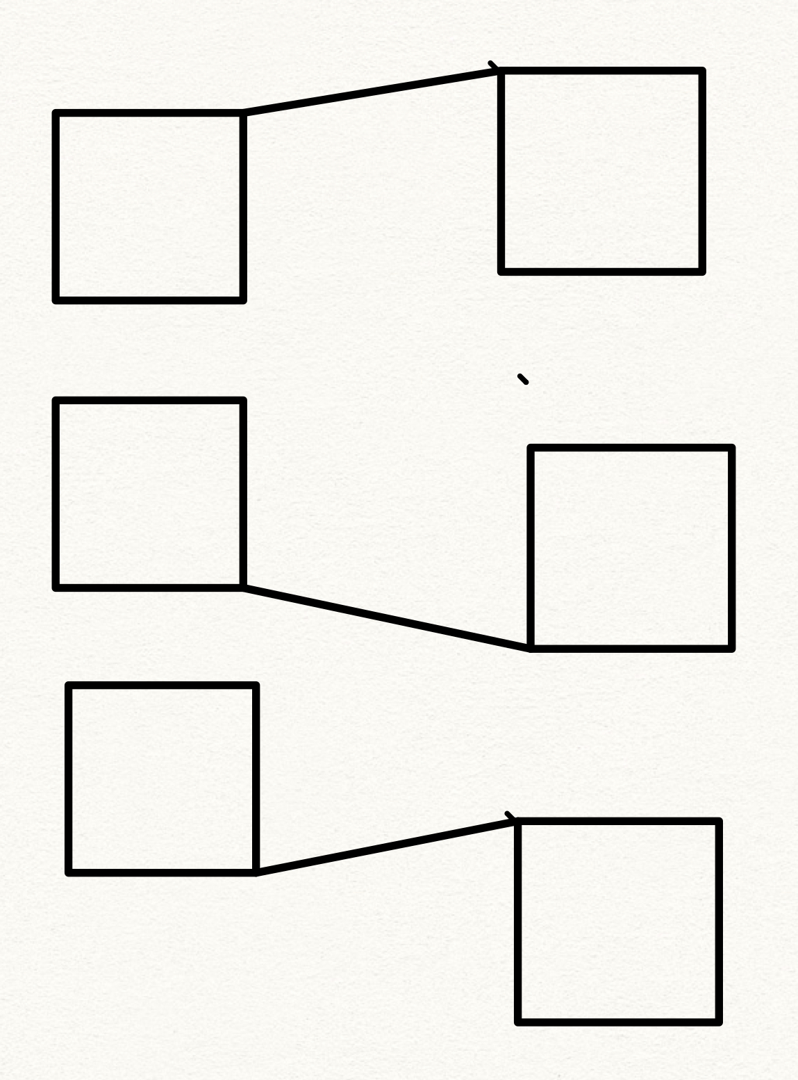
Example: I want to do something simple — line up a bunch of notes in a neat stack/column and then draw a bunch of criss-crossing connections to a second column of notes on their right. I need the notes to stay stacked (their original order is an important part of my brainstorming), but I want to show their interconnections. You or I would just draw lines from edge to edge across the gap. Presto! Simple and visible. Scapple insists on connecting the notes through their tops/bottoms with the result that you can’t see what’s connected to what — intervening notes totally obscure the lines!
Couldn’t you just assign notes an additional parameter which users could select: ‘connect via top/bottom’ v ‘connect via sides’? The default setting could remain the centre node, but there would be this possible override where needed. Nothing fancy involving specifying exact anchor points (I can see how that might complicate the UI) — the connections are automatically drawn from the centre point of the edge — but at least you would avoid absurdities like the one I’ve described above…
BTW, I do understand why Scapple hasn’t got much attention lately — you guys have been doing an amazing job with all the epic updates to Scrivener! But thought I’d log this thought with you folks while I think of it, for when you do return to it. You’ve got a terrific application in Scapple; just needs a bit of fine-tuning…
Yeah I guess the idea there is that if the notes are in a stack then they are already implicitly connected to one another by virtue of sharing that common grouping mechanism.
That aside, I would think that even if the connection line went from the side it will still be messy, because they would all then be overlapping each other on the same “rail” alongside the stack, if that makes sense. Sure you might connect two on the left and another two on the right, but it’s still pretty limited in that there are only two sides to work with. I guess another way of putting it would be that this wouldn’t solve a visual issue of drawing connection lines between stacked notes, it would merely move that issue from one side to another. Right now all of the lines overlap in the middle—putting them on the sides would just overlap them on the sides.

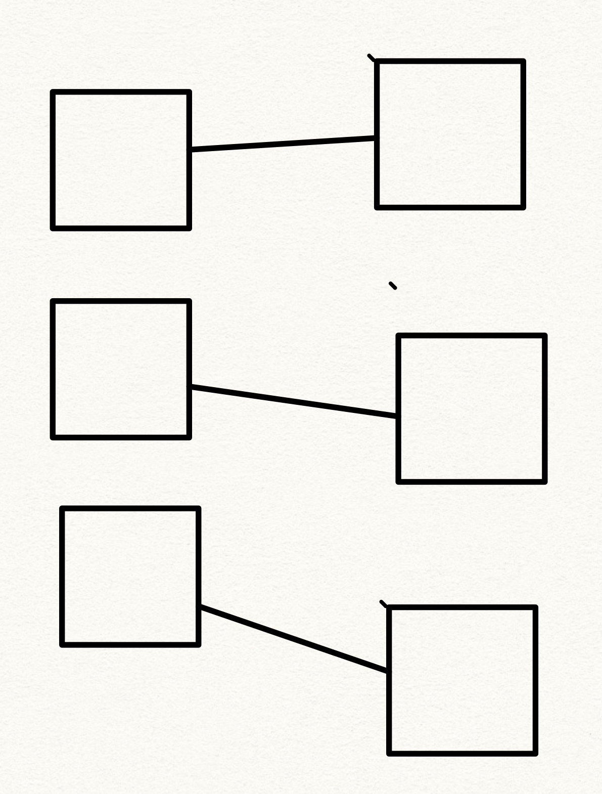
[size=80]On the left: is the top connected to 2 and 3 or just 3? On the right, we can barely even see that 1 and 2 are connected.[/size]
I guess overall I don’t know if choosing where the connection line attaches to the note is ever going to make much sense of connecting notes so very close to each other all stacked in a column like that. Again, that they are in a stack is meant to imply they are connected already.
Thanks for the words of encouragement. We’ve got some huge updates to Scrivener in the pipeline, lots of exciting things to share there in time, but we’ll get to Scapple again too.
Aha. I think I’ve been unclear here: sorry! It’s very hard to talk about these things w/out pictures! Thank you for putting your graphic in — I should have put one into my own post, but alas have forgotten how to upload images into phpBB…
Let me try to clarify: I’m not trying to draw connectors between items in the SAME stack. As you observe, it’s redundant: they’re already ‘connected’ by virtue of being lined up into a sort of list. And it is indeed hard to see how you could draw lines between stacked items which are visually illuminating — even with the full freedom of pen and paper!
What I want to do (and seems to me Scapple could usefully support) is something else: to draw connections between two different stacked lists. That is, to visually mark the correlation between (say) item 1 in column A and item 6 in column B.
(column A)[list][list][list][list][list][list](column B)[/list:u][/list:u][/list:u][/list:u][/list:u][/list:u]
Item 1 text text text text text[list][list][list][list][list]Item 1 more text more more more[/list:u][/list:u][/list:u][/list:u][/list:u]
Item 2 text text text text text[list][list][list][list][list]Item 2 more text more more more[/list:u][/list:u][/list:u][/list:u][/list:u]
Item 3 text text text text text[list][list][list][list][list]Item 3 more text more more more[/list:u][/list:u][/list:u][/list:u][/list:u]
Item 4 text text text text text[list][list][list][list][list]Item 4 more text more more more [/list:u][/list:u][/list:u][/list:u][/list:u]
Item 5 text text text text text[list][list][list][list][list]Item 5 more text more more more[/list:u][/list:u][/list:u][/list:u][/list:u]
Item 6 text text text text text[list][list][list][list][list]Item 6 more text more more more[/list:u][/list:u][/list:u][/list:u][/list:u]
The problem here is one of angles: if you are connecting two items that are more or less level with one another, the connector will emerge from the sides of the appropriate items. That is, the line will actually LOOK like it is connecting them! But if the connection runs at a sharp angle, from the top of one stack to the bottom of the other, the geometry will make the line appear to connect two other items, located closer to the middle of the stacks.
My thought was that the simplest way of getting round this was just to give users the option of forcing the lines to be drawn from side/bottom/top where desired, rather than the middle of the text box. To keep things simple, the precise anchor point could still be mandated by the program (presumably the centre point of the side). But this modification would make it possible to construct much denser sketches than is currently possible, and to take real advantage of the stacking feature.
To put it another way, at the moment Scapple is chiefly aimed at the very first, wild, totally freeform brainstorming of ideas across a wide canvas, where there’s plenty of room for connectors to stretch out. But with a few modifications, seems like it could also cater to the next stage of mental organization, where you try to marshal your first doodled thoughts into some kind of logical order — in which the sorting of things into stacks and lists, while maintaining the connections between them becomes important. Think of it as a sort of intermediate phase between the napkin doodle and an actual outline (when one moves to Scrivener!). Not sure if this is an aspect you’re interested in pursuing, but I hope so — it would vastly expand Scapple’s usefulness as a brainstorming tool!
In case you are…I hope you don’t mind my taking the liberty of suggesting a few key improvements to that end:
a) allowing users to specify which edge connections are anchored to.
b) allowing users to specify whether connection lines are drawn OVER or UNDER any intervening boxes. (Sometimes the connector is more important to see than every last letter of the text it crosses!).
c) providing a simple Group/Ungroup function, so users can manually group together text boxes they want to move around together. I know you can do this via magnetic background shapes or connectors, but honestly sometimes that feels like a very long way round just to be able to manipulate boxes in a simple intuitive way like any drawing program would do…
Just some ideas to file away for when Scapple floats to the top of the pile again! And thank you again for your patience with all my queries. Scrivener does have a way of producing enthusiasts, doesn’t it? 
I would like to advocate for the resuscitation of the “nearest-corner” connection preference.
There really does need to be a “nearest corner” option for how connections are made. The current mode which always targets the middle of the node makes maps of even just moderate complexity visually unresolvable – one must move nodes around to discern which node is actually connected to which. I find this true in every serious use I have made of Scapple. A nearest-corner preference would resolve such visual ambiguity in the main.
An app or document preference for nearest-corner would be great. Even if you had to neutralize certain frills (rounded, cloud, blat corners) for this option, it would be entirely worth it, imho.
So, I hope the nearest-corner project gets back on the Scapple development list.
-gr
p.s. Perhaps one would need to hold that there are five possible points of contact - four corners and the middle (this last being desirable for columnar arrangements, for example). Couldn’t help but puzzle about what an algorithm for resolving the corner choice would be – sort of a two body problem. Does a two-pass system unfailingly get the right pairing? My intuition suggested this procedure: Start at middle of node #1, calculate which of the five hotspots of #2 is closest to that. Choose that hotspot on #2. Then in a second pass calculate which of the five hotspots on #1 is closest to the chosen spot on #2. Seems sort of sensible, but I couldn’t figure what a crucial test case might be. Okay, I am getting out my compass and straight-edge… Don’t make me come over there!
I disagree. That would make the connection point jump around when you move an item. With more complexity comes more problems, not less.
Which is why this would be an “app or document preference” so that users who understand the implications can use it and those who don’t are not forced to.
Lunk, thanks for this. I appreciate your pitching in to help think about this. I would like to distinguish between 1) the goal of making more discernible what is connected to what and 2) how this might be achieved. I am not hearing any disagreement about point (1), so maybe we agree on the goodness of that (if not also its importance).
Your point seems to be a concern about implementation. Undue or disconcerting jumpiness seems like a valid thing to worry about. I don’t pretend to know how to implement anything, but you may have seen better into the implications of the little extracurricular sketch I made of an algorithm. For my own part, it is not intuitively obvious to me that the sort of procedure I sketched would make unhappy jumpiness, just as I was uncertain if it would pick the intuitively correct corner to cleave to. But maybe it would.
Just as a thought experiment, let’s try to imagine an implementation that would mute any concern you have. Devinganger is right, if it is a Preference you personally need not be “concerned”. But at the same time, we should also be interested in someone with your same concern who also really wants to be able to better visually resolve what is connected to what. (For all I know, I might be such a one!) So, how could we achieve the benefit of corner cleaving without undo jumpiness?
Consider: First, let’s note that the visual connection point (point of incidence) on a node moves around when you move things already, because the incidence point of the connection line slides along the frame when you move either node. Now, imagine the target of connection remains dead center, but we “magnetize” the corners, so when the incident point gets close enough to a corner it snaps to it. Magnetization of zero gives you the equivalent of how Scapple works now. Magnetization of 100% gives you the equivalent of the suggestion as I first posed it (always snap). Now just imagine we set the magnetization level to the highest strength that you would still be comfortable with. Assuming that level is not zero,* you (or the doppelganger of you we are imagining) now get (some of) the benefit of corner attachment but can mitigate any level of jumpiness you might find disconcerting. And maybe it would even turn out there is a mag level which could be set that would be pleasing to all!
Again, it is not intuitively obvious to me that there would be disconcerting jumpiness in connections on the earlier initial picture. But it just may be useful to demonstrate to our favorite developers that there would be (even if so) reasonable ways to achieve better visual discernment via some kind of corner-cleaving algorithm.
I will be happy just to get the corner-connection Wish back on the table.
Best,
gr
- Surely there is a sweet spot there even for your most obstreperous evil twin!
I played a little with this and I don’t think that “attach to nearest corner” ever looks better than “attach to center”.
1 Like
Okay, Lunk, now I am not sure you are really trying. It is not hard to demonstrate a case where nearest corner “looks better” both in the crucial sense of showing more clearly the information content of the diagram as well as aesthetically. The following is surely a case in point. And a relevant one, because it is in precisely such conditions that middling muddles the very information the chart is supposed to capture.
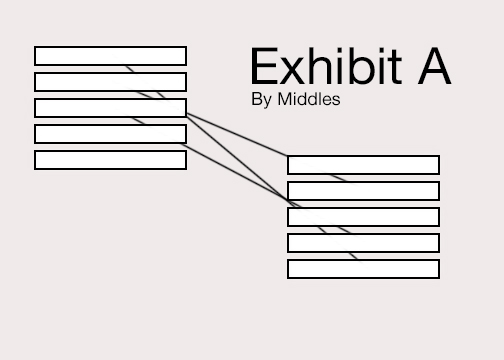
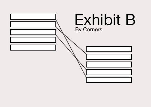
There are certainly use cases where you may want middling for aesthetic reasons. That seems fine. No one is arguing against that. What is puzzling here is that you seem to want to press something further which would deny the obvious virtue exhibited in the above cornering diagram.
-gr
P.S. I note that in your squared off, non-overlapping case, your preferred middling diagram looks as nice as it does only because the particular chart is so arranged that the point of incidence in each case sort of approximates the center point of the inside side. This is an accidental feature of your diagram, not the fruit of middling. If you move those boxes at different distances vertically from the others, middling can produce much the same kind of “off-sides” points of incidence you do not like in your corners chart.
For what it’s worth, here is a real world example of a scapple map I happen to be working with at the moment.
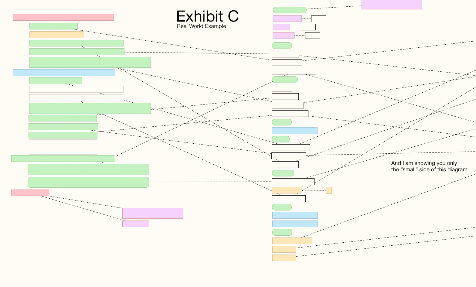
-gr
P.S. Lunk, your squared-off-node diagram (middling version) made me think the in cornering algorithm the centers of sides perhaps ought also be contact points (or “magnetic” in the sophisticated version). In which case, your preferred second diagram would turn out even better (!) because the connections would hit the midpoint of those inner sides (which they are only approximating the good look of now).
That would be a better idea, as it would be possible to use also with note shapes without corners.
But even so the connection point would sometimes “jump” when notes were moved, unless you could lock it to only use note sides and not top or bottom.
A philosophical comment: isn’t the problem, you are showing an example of, a typical example of a situation where the original philosophy behind Scapple collide with the way you want to use it? The way I see it Scapple was meant for a fairly unordered, unstructured connection of notes spread out, like shown on the L&L web site. You are trying to use it for a very ordered and structured situation, with columns of neatly stacked notes etc. I have seen something like your image in connection with some other app which produced something like your image, but can’t remember where. Possibly an iOS app.
Isn’t it all a question of spatially unstructered notes versus spatially very structured notes in a kind of grid, i.e two different use cases? I think Scapple was designed for the former.
Jumping back in here after a long time, so I may have missed some of the finer points of the discussion above; apologies if my comments are off base!
From my point of view, attaching to the center of sides (or top/bottom), rather than corners, would definitely be the most clear, flexible and elegant. But the key thing for me would be being able to CONTROL where the attachment point is on an item-by-item basis. By all means, have center-of-box as the default (works well in the majority cases), but the option to draw connectors where you want them (eg. select a box + connector and rt-click to choose the anchor point for that particular connection) would be transformative. Or is that too complicated to program? Basically, the ideal would be to do with Scapple what one instinctively does with pencil and paper, viz draw a line where it will fit — something that only human intelligence can figure out! The way Scapple is now, I’m constantly having to make crazy little adjustments to the whole scapple whenever I add a new box just to ensure connection lines remain clear; it would be much easier just to manually shift a connector or two, rather than try to outsmart the whole algorithm. Not sure paper and pencil wouldn’t be simpler!
FWIW I’m not just working with stacks (though I think that was my original example): I find this an issue with free-form, thinking-aloud type scapples too. I know some people brainstorm by jotting ideas down anywhere on the page and relying on a network of lines to make the connections clear, but I think in very spatial terms, grouping and organizing my ideas spatially as well as by connectors — to me, that’s the only way thoughts are visually legible (how do you indicate hierarchy without spatial organization?). To put it another way, I think geometrically, not topologically. And so long as your boxes have to be in a particular spatial relation, the problem of placing the connectors becomes vital. This is particularly true if you have a lot of boxes you want to keep all visible on a single laptop screen: removes the option of spreading things out to untangle your connections!
I could give real-life examples if I knew how to get an image into this post. Is there a simple way to insert an image here, or do I need to upload it to a host site first? : )
Just to jump back in here and explain my earlier brief comment, since this seems to be going on—this inevitable line of thinking is exactly what lead to the idea be shelved. Nearest-corner, as a simple checkbox that enables a basic algorithm, produces erratic results that encouraged more fiddling with relative positioning—while one of the design goals was to minimise the feeling that one needs to do that at all. Consider how typing enough to line-wrap would quite possibly cause a whole chunk of connectors to shift their opinion on what is nearest, in a stack, for example, in a way you had carefully avoided by positioning it otherwise, before.
The best solution for this problem is one that requires quite a bit more programming, on the visual side and internally. You need to graphically depict the nine snap points each note/shape has and make line endings interactive in some way, at a minimum, both of which are significant departures from its current infrastructure (and indeed it feels a bit heavy-handed in Scapple’s otherwise simple UI). All of that needs to be on top of a default toggle (centre vs auto-nearest), and may then lead the software even further away from its core design—because now there is another visual thing to manage. If the default goes from good to wild mess after editing a few notes in a stack, are you going to move on and keep working, like you do now, or are you going to feel compelled to start clicking on tiny little anchor points and dragging lines around to get it looking right again (for the moment)?
And that’s probably why the idea has stayed on the shelf, since then. The automatic solution is the one that really fits in with Scapple’s core ideal of not having a thousand fiddly things to manage, but since it doesn’t work well (especially so in a program that is chaotic in its layout rather than one that works more like classic illustration software), the solution that lets you solve erratic trigger point issues takes the design into a heavier design management place than the rest of the software.
Well this is true, but one thing I’ve learned is that no matter how hard we pitch that this is meant to be a messy scratch pad for visually oriented thinkers—people who grid will grid. There’s nothing wrong with that, to be clear! One can use a sheet of paper however they like. Some will take ten minutes with a ruler and protractor to carefully mark out positions before drawing up an idea. Others will spill ink all over the table in an effort to work more quickly. We don’t really care how you use Scapple. ![]()
…to be correct: of course they do connect to all 4 sides of the note, sorry - but: i cannot CHOOSE to where they connect which does not enable a clear layout.
(…see e.g. miro - there it works perfectly…)
I was wondering if you can change where the connections attach to things in Scapple.
It seems to always connect in the middle of the object. I would like to make it connect to the right side on some objects, the left side on others, and on some top/bottom etc.
Thanks for your help!
I don’t think so; but it would be nice.