I chime in… by saying that I am not in the least bothered by it, and I have the latest 2019 iPad Pro. 
? I don’t see any borders (latest iPad pro, 12.9)
Agree with OP - please please support the 2018 iPad pros. The black bars top and bottom are really annoying. Its been 7 months now!
Which model do you have? The 2018 iPad Pro is currently the latest “iPad Pro” model. The only 2019 iPad models are the iPad mini (5th generation) and iPad Air (3rd generation). The former has a 7.9" diagonal display measurement, while the latter has a 10.5" diagonal display measurement. Both match the screen resolutions of previous devices and, as such, have inherent compatibility with all but the oldest of iPad apps.
The iPad Pro, on the other hand, comes in two sizes: an 11" and a 12.9" diagonal display measurement. These two new screens contain resolutions that do not match any previous device resolutions. As such, they require that apps be built in newer versions of Xcode to take full advantage of the new screen real estate.
If the applications were built using older versions of Xcode, as is the case with Scrivener (which hasn’t been updated since December 2017), they are not able to make full use of the screen real estate and black bars exist in the unused space. The current iOS Scrivener app version predated the introduction of the new screen resolutions by 11 months and is not aware of or compatible with the new screen resolutions.
All it would take is moving the Scrivener app to a newer version of Xcode and implementing that version as an update to remove the black bars. Given the duration of time that has passed since the last update, however, this doesn’t seem to be high on the list of priorities.
I have the latest 12.9" iPad Pro.
I don’t know how easy or difficult that would be. Neither do I know how Keith prioritize the things he wants to do.
But I do know that I am not the least bothered by the date and battery charge level being displayed as white text on black background. And I do think my opinion is as important as the opinion of those that are bothered by it. ![]()
I would imagine that updating the app and not including some of the other necessary bugfixes/improvements that have been stacked up would be seen as little short of hostile by many people.
Why?
It’s not just time and date being displayed on black bars. It’s screen that the app isn’t using.
If you are writing a document in “full screen” mode, it’s not full screen mode. If you have it side by side with another app, it shrinks that app too.
I’ve been asking about this for months and months ![]()
No, it’s not. No app can display text where the iOS is displaying the time, wifi, cell network, and battery status, and they can’t display the keyboard or text at the bottom where the black “home key” line is displayed by the OS.
So the only difference is the background color, with the iOS info being white on black background versus black on app background color.
That part of the screen isn’t used by the apps. it’s just for looks.
If you have an iPad with Face ID support and no physical home button, there is a bar at the bottom of the screen that you swipe up to go home, just like a Face ID iPhone has. On Safari and other apps that are updated for this iPad, their displays go all the way to the bottom of the screen. If an app like Scrivener is not updated for this, their displays are slightly shortened to leave space for the bar at the bottom. This also means that in split screen mode, Scrivener will force the other app to be shortened, even if the other app is already updated.
It’s a minor inconvenience, yes, but I confess it’s a little frustrating not to see Scrivener updated for this by now. It’s not only missing this, it’s missing a fair number of modern iOS conventions.
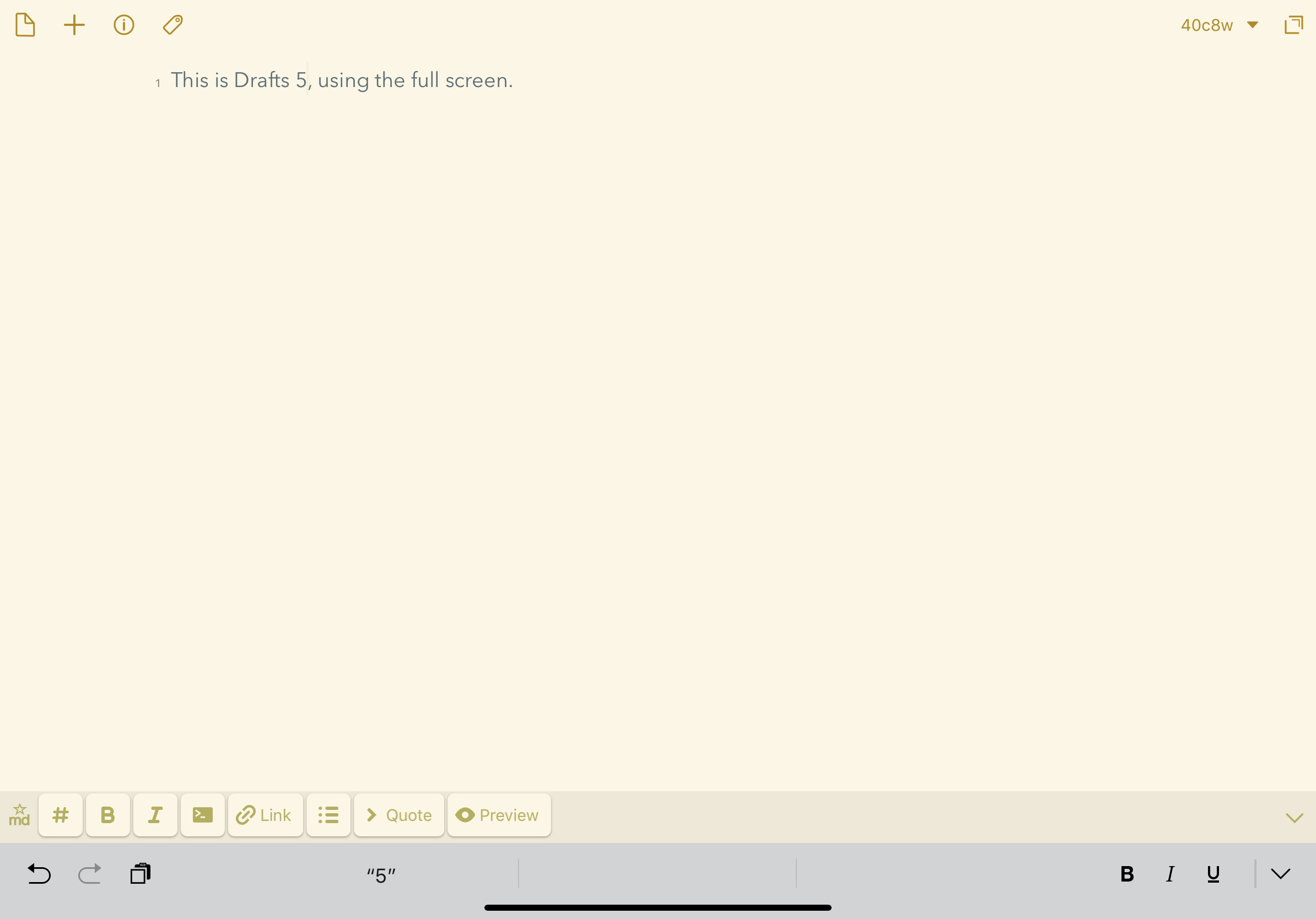
That actually isn’t true. Apps can use that area, at least on the 2018 iPad Pro (not sure about older models). One example is Drafts 5 — see screenshot. No bar with the time and date. Another example is the Kindle app — it takes over that bar and displays the title of the book and the time, but it is clearly NOT the standard date/time bar. I know I’ve seen this in other apps as well.
Whether or not this is a big deal is a matter of opinion I suppose. I personally don’t think it is a BIG deal, but I do wish it would be corrected. And I think an update that just fixed that issue and nothing else back when the 2018 iPad Pros came out would NOT have upset anyone, as minor compatibility updates like that right after an OS or hardware update are pretty common.
You’re correct. Most games hide that area and it’s really annoying not to see the time and battery status.
My opinion is still that it is a low priority update. 
Are you saying you would never want to see the time, battery and other status while in Scrivener? I don’t know if this would be a thing that is easily made optional, or as a condition of how the software is used. We don’t have a “full screen” implementation in the sense that lunk describes, like games do that take over the entire display. We use the basic system framework for this stuff, which doesn’t ever hide the upper header bar. So if you’re asking for something beyond that, it’s probably a whole lot more work than just a checkbox somewhere in Xcode.
No, I wasn’t trying to suggest that Scrivener should do something like the screenshot. I was just correcting an incorrect statement in the thread that apps can’t use the full screen area. Many do — and NOT just games. I see this full-screen view in apps such as Drafts, GoodNotes, Kindle, Ulysses — all productivity apps, not games. I am doubtful that all these apps are doing completely custom work for their display, so perhaps there are standard frameworks that do allow a full screen.
The minimum I would like to see would be like how Safari looks — so the time/date still show, but the scrivener background extends all the way into the rounded corners. But, as I tried to make clear in my original post, I don’t see this as a huge deal!
Some of the apps I have that take over the whole screen do make it a preference — GoodNotes 5 comes to mind. It has a setting to hide or show the status bar, so those who want the full screen experience can do so, while those who don’t can keep the status info in view all the time. I think Ulysses also makes it a setting. So clearly it can be done. Perhaps it is a ton of work, I have no idea.
Well all right, I don’t know too much about productivity software on iOS!
You’d be surprised. Many even bother to rewrite core stuff like alert dialogues. ![]() Our approach is a bit unorthodox, but it has served us well. Generally if you stick to stock UI then when the system updates you benefit without having to do much, if anything. When you start overriding everything, then you get into that grind of having to pump out updates every time Apple twitches.
Our approach is a bit unorthodox, but it has served us well. Generally if you stick to stock UI then when the system updates you benefit without having to do much, if anything. When you start overriding everything, then you get into that grind of having to pump out updates every time Apple twitches.
We’ve had to go a little longer between updates this time around for various reasons, all good ones, and some unfortunate—but that we can do that is good reason to not rewrite basic widgets, even if sometimes you don’t look as trendy.
As for the clock, maybe it is a simple flag that we can build in. I don’t actually know about that. We can take a look at it, though if it does involve rewriting our own buttons and toolbars and split views—probably not!
I don’t post very often, but I’ve been using Scrivener on both the Mac and iOS for quite some years. I’ve just got a new 11’ iPad Pro and while it’s a lovely device, I must confess I’m absolutely hating the home bar/indicator at the moment, and particuarly in apps such as Scrivener where it’s distractingly obvious.
I know there’s a workaround with Guided Access, but this locks you into one app which isn’t practical when writing–at least for me. I too often have to pause to pull up Safari, or chase a reference elsewhere. I also dislike the black bar along the bottom where the home bar lives, but I’m less worried about that as I assume it will be rectified when (please make it ‘when’ and not ‘if’) Scrivener is updated to support the iPP 11’s aspect ratio.
As for the home bar itself, I wouldn’t mind it so much if the contrast was not so obnoxious in Scrivener (and Ulysses, for that matter). Art apps such as Procreate etc deal with the home bar by reducing the opacity so it’s still visible, but not intrusive. Other apps allow for it to be hidden altogether (Apple’s Books does so, for example, and so does Safari’s Reader Mode). It can still be invoked/opacified with a touch, but the overall experience becomes comparable to the traditional iPad experience–fullscreen, with no chrome distractions.
It would be amazing if this could be implemented, especially as the home bar (love it or hate it) seems here to stay.
It would be nice if we could get some sort of an update with a road map – even tentative. The long time between update cycles, and no real word on what is planned, is a concern I have with Scrivener on iOS.
Before the new iPads, Scrivener made full use of the iPad Pro screen. When you wrote in full screen mode, it blocked out the clock and other information for a “distraction free” environment. Presumably it still does this for the older generation models.
It should be fairly easy to maintain that when it gets the screen size update.
Personally, I think it’s a really nice feature when a writing app shows nothing but the “page” and this was something I liked about Scrivener on iOS before the new models.
Yeah, in double-checking that on my iPad Pro (an older model), it does hide the status bar at the top of the screen, when tapping the button to hide the binder. Hopefully that will be an easy thing to reinstate.
Frustrating, I was in touch with support back in April, and still nothing. How hard can it be to fix this? i avoid using the app now because of this! I really want to get back at it, but this soooo triggers my OCD, it drives me up the walls. By now, scrivener is the only app on my iPad that didn’t update for this.
As noted previously in the thread, it is more a matter of not having had time to look at it. I have no idea how hard it is to fix, but it’s probably not difficult given we just use the stock Apple kit.
I can’t see the problem myself, can someone post a screenshot? In my mind’s eye I’m just seeing the tiny little clock and battery strip along the top of the screen. Surely it’s more than just that if find yourself unable to use the software?