Your mum’s dad always struck me as a bit of oik, to be honest. Came up here creating wastelands, then had the cheek to call it peace. Slaughtered poor old Galgacus’s mob just for pointing it out, too.
Of course, some of them down that London way fell for it – “Look at us, all Roman and civilised like” they said, poncing around in their new togas.
“Idque apud imperitos humanitas vocatur, sed pars servitutis sit, me old muckers” we told them.
When you think about it, the Sasanaigh have been irritating their neighbours for millennia. If they hadn’t invented Scrivener, they’d be utterly irredeemable.
love the new look of Scriv 3, particularly composition mode. going to do some fiddling to try and make a “night mode” that looks like composition mode for the regular screen.
We Deceanglii sat around here minding our own business and worshipping the River Dee (Long May Her Waters Flow), when Tacitus’ lot came and built a fortress on it and started boasting about invading Hibernia. Then they buggered off up North to do a bit of Pict Palaver.
Slow down, we said. Stop rushing about. Have some cheese. Oh and you may want to put a bit more mortar in those walls – we’ll want to walk round them one day.
My two cents is I like the new UI. I wear +3.0 magnification reading glasses and on digital I also increase all the fonts that I can so I am no 20/20 reader. That said most of the UI interface is symbols anyway and are easy to see. The exceptions are the paperclip (I had to put my face almost to the screen to make sure it was a paperclip) and the trash can - those are rather hard to see. But once you know where they are there isn’t really a further problem.
I have problems with depth perception so I can’t really see the flatter look. Found the default setting for the composition mode to be a strain, but that is what setting are for.
The forum font though is a little on the light side - a strainer that one.
The fact is, you British type people are a source of constant fascination to us Americans. I sometimes believe that I’m watching an ant farm being run by hobbits. You sound normal until the substance of your thesis becomes clear. Then, you transform into a weird mix of fantasy and history. Very strange.
I know. It’s a burden, but one which we try to bear cheerfully. At least it provides your Moving Picture industry with a ready made source of Villains and steady work for our Thespians.
Aye them down London now speak of a mighty awakening as Britannia loses her chains, throws off the yoke of European influence and once again faces the world. Indeed they speak of little else but to question what those Romans, and others of the European persuasion ever did for us. Let us be free they cry, that we may recreate the noble empire that surpassed even that of my illustrious ancestors.
They promise wealth and riches will flow freely even unto the poorest of the land.
Twas ever thus. As I write in my Annals, (copies available in many good charity shops) the delusions of our leaders are often a wonder to behold.
The forum definitely needs the opportunity to choose MUCH higher contrast. It’s very straining to read now. I’ve been lurking for years, finding good tips and tricks, and it’s always been a pleasure - but now it’s too much Javascript smooth scroll nonsense and low contrast fonts and colors to be enjoyable. It doesn’t even open properly in my browser of choice, Dillo.
The ability to choose plain black and white, and get rid of all the muted font color and background tints would be enough.
Find the forum font hard to read, particularly the punctuation marks, and miss having pinch to zoom enabled by default (though I know how to override the site’s setting).
Think the site and forum are much improved in the main.
Agree strongly with the need for higher contrast or a strong black font. If the appearance was like the menu fonts list on the “post a reply” page it would be fine. At my age (probably not the oldest user of this forum) my eyes have a very hard time reading the material, so PLEASE MAKE THE FONT BLACK and/or BOLD.
I am experiencing the same issues as several posting here. I’ve had the display increased contrast turned on for both Macs for a couple of years. My 75 year old eyes, even with the cataracts fixed and reading glasses, can’t tell the difference between a comma and a period unless I move to half my normal distance from the screen and use the highest magnification lenses in my tri-focals. It makes the forum tiring to read for more than a few minutes.
I spent some time fussing with backgrounds, fonts and font sizes and have ended up with a nice easy to use interface for Scrivener on my Macs. The only problem I have is the synopsis in the inspector is really tiny on this iMac 5K. I can read it, but barely. I haven’t been able to figure out a way to adjust the background color in the Inspector’s synopsis except in Composition Mode which I have never used. But that’s nothing new with S3, I had the same problem in S2. At my age, I’d make the argument that all the text on the screen should have a percentage adjust meant like the main editor to adjust it for aging eyes. I have the synopsis font set at 18 point so I can read it easily in outline mode. Unfortunately that doesn’t work in the inspector. The main editor is using 12 point Courier Final Draft @ 175%. With a light grey background to moderate the light, it works well. I have the binder with System Regular 18 point and bold folders with a customized background color.
I love the highlight for the focus line in the main editor. I wish it worked in outline mode.
Whilst I agree with much of what has been said regarding the new flatter appearance, given the apparent impunity with which the trolls seem to be able to post spam, I suspect the new look is the least of the mods problems…
As to the forum font, I’m not sure about any official changes. But in the meanwhile if you install the Stylish browser theme and check the online library for styles for this site, you’ll find a Bolder Sans theme I’ve created and use myself.
It has been possible to modify the index card look since version 1, though. No need to use the defaults if you don’t like them! I’d go through all of the Appearance pane settings in the “Fonts” tab if you haven’t done so. There are many areas of the UI that can be magnified through the use of custom fonts.
That’s an argument that should be made to Apple, but they’ll probably tell you that’s what the full-screen magnification option (the version that follows the mouse pointer) is for—or if not that, simply lowering your monitor’s scaling level in the System Preferences: Display panel. Handling this kind of thing at the application level isn’t realistic on macOS—it’s not a scalable UI.
Fortunately both can probably be addressed at once. We had to defer a larger forum system update in order to make a timely launch. Such an update will require tweaks to the skin, and so we’ve got all of the suggestions that have been made on a list to look over when that happens—and hopefully that will help with the spam too.
I’ve been changing fonts and background colors and have made everything but the Synopsis in the top window of the inspector nicely readable. Alas, The display font for the Synopsis in the top window of the Inspector does not change when I change the synopsis font in preferences. Changing it in preferences fixes the readability problems I had with out line view and I get along fine with the note cards. What I wish was easier to read is the Synopsis in the top window of the inspector. It’s really tiny on this 5K monitor, or any monitor for that matter. Scrivener 2 had the same problem.
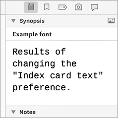
Hmm, that’s not an expected result in fact. You are definitely changing the “Index card text” setting in the Appearance: Index Cards preference pane? This is the result I get with an 18pt font set:
Okay, now I see my mistake. I mistakenly thought the “Synopses:” font under the “Outliner” preferences was supposed to change the font of the Synopsis in the Inspector (They are spelled differently and I still missed it). <slapping self on forehead - no wonder my cranial foliage is retreating in fear> I had no idea the Synopsis font was actually the index card (digital ones anyway - paper ones for sure) font because I never use index cards. I increased the index card font to 14 for both titles and text which makes it readable without having to lean forward and squint. Problem solved!