I’m embarrassed but I should be, looking at that! It honestly wasn’t anywhere near as bad or salacious as it looks, though the baths don’t seem to have been somewhere for the faint-hearted! Even after a couple of years I remember the tales of people being punched because they were mistaken for a slave when they merely bumped someone’s elbow, for example!
Lose the Slaves and Violence (well, we did shoot a tree, for reasons we won’t go into here), and those collections sounds like my first date with my wife of 43 years and counting. Though, technically, Invite Fishing should come before Naked Bathing and Sex.
GREAT THREAD!!!  Keep in coming…yeah!!..how about some S&M 8)
Vic Caligula
Did we just witness the spawning of a new K?
I assume you mean this: youtube.com/watch?v=Dme2J0wccJY
Whosoever of ye raises me a white-headed geyser with a wrinkled prow and a crooked flutter; whosoever of ye raises me that white-headed spouter, with three holes punctured in his plastic bottle—look ye, whosoever of ye raises me that same white spew, he shall have this gold ounce, my boys.
I know it’s an old thread, but I built a layout I really like and had to share! I’m on the Windows version (no money for a mactop) free trial until I win NaNoWriMo and get the discount  Anyway:
i1219.photobucket.com/albums/dd4 … d55135.jpg
Edit: The background in my corkboard is ‘Tardamask’, and I themed my whole Scrivener on it.
Probably a silly question, but how did you manage to import a background?
On the windows version, I hit F12, went to the Corkboard tab, and there should be an option there for Custom Background. ![]()
It’s very similar on the Mac. The Corkboard preferences tab has a “Corkboard background” option where you can choose between a custom graphic, plain colour, or one of the provided defaults (such as our corkboard texture).
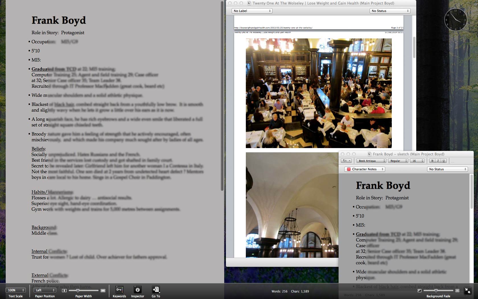
Still learning and haven’t really learned what a collection is yet. I am writing a spy book, and wondered if anyone had any comment on my use/layout ?
In the compose layout I am using photos of a London Restaurant as preference for a dialogue over dinner there. Who needs to travel any more ? ![]()
I like it the minimalistic way. But I use the speech recognition software Dragon Dictate not only to dictate but to navigate in scrivener as well. So all the functions are just one voice command away. With one word I toggle on and off the binder, the inspector, notes, full-screen mode and so on.
Oh dear, I wrote a nice post and went to upload my screen shot, which was taken with Mac’s native Grab tool but that only creates tiff files, which this forum does not allow. Sigh.
Preview can save files into a few different image formats, PNG and JPG included.
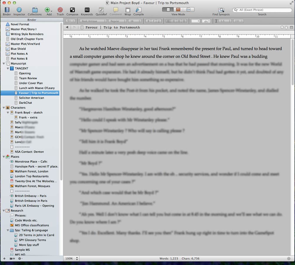
I suppose it’s time I shared my layouts for Scrivener. I like to think that I have a pretty typical set-up, but there are a couple of things probably worth mentioning…
Here is my planning stage layout… It’s been set up to build an overarching plot on the corkboard. I typically just use the regular corkboard rather than the free-form version, and I’ve set it up to have what to my eyes is a well-proportioned index card that fits 24 to the screen (4 rows of 6), with no particualar need for the Inspector panel at this stage.
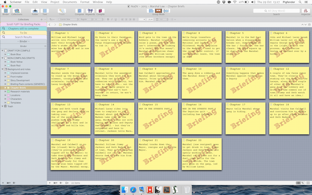
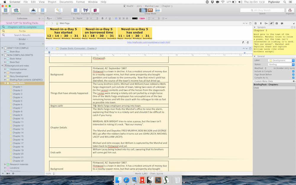
Here’s my regular writing environment, with the Inspector now engaged. If it’s for a NiaD, I’ll use a split Editor to show a web-page with a countdown timer on it (because I hate myself). Almost all my writing is done in this environment.
Edtiing, though (or to be more precise, Second / Subsequent Drafts) are done in the Compose mode. Here’s where I just focus on polishing language that’s already been written. The completely different environment / colours trick my brain into seeing the words with fresh eyes.
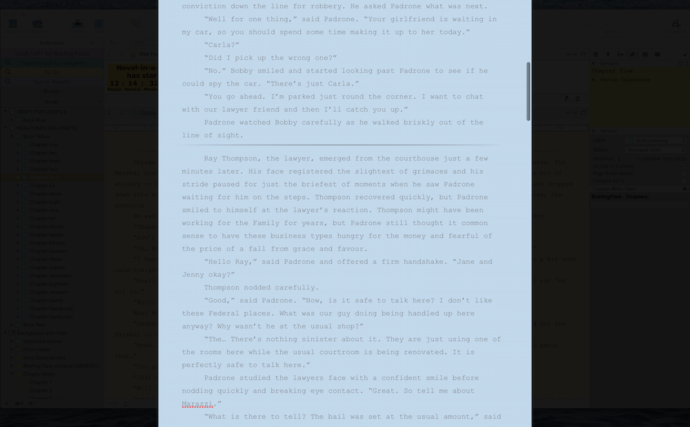
I’ve obviously been in and tweaked the default colours to be easy on my eyes and taken a few things off the toolbar that I don’t use. The most ‘custom’ aspect, though, are the fact that I’ve modded Mac OS’s system font to something less cartoony, and modded the Scrivener icons themselves to something more traditional.

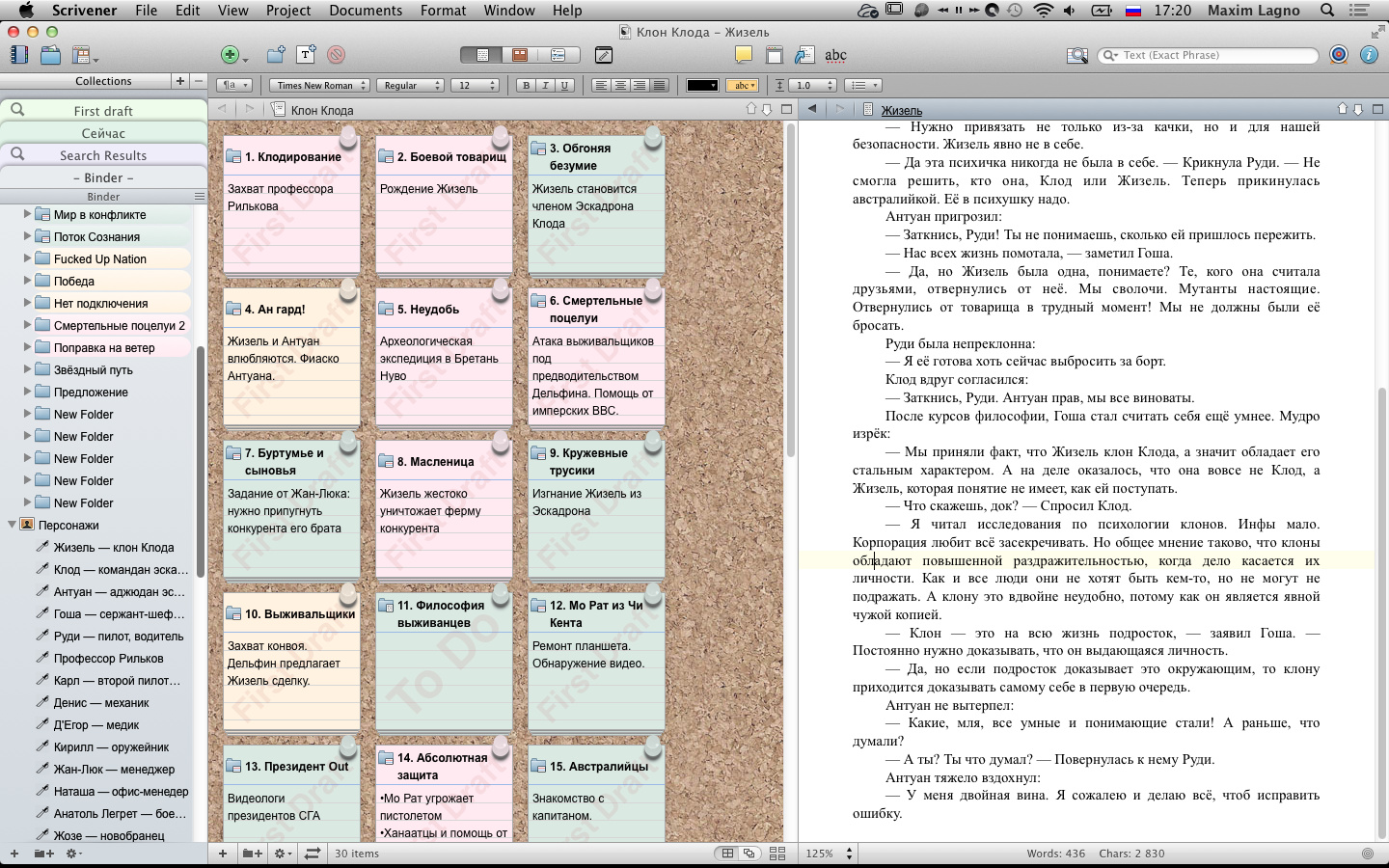
I am using Scrivener as the main planning, writing and production app for my novel and ebook projects.
My current novel series (science fiction) already has more than 15 Million characters or 1,5 million words in one project file, divided in 52 episodes. I structured the chapters in a way I can create novel episodes or novel collection books out of the master data (binder) via collections.
I love Scrivener for being able to handle big size writing projects like a charm and do not want to miss the app for my workflow anymore.
Greetings,
Thomas / Germany /Stuttgart
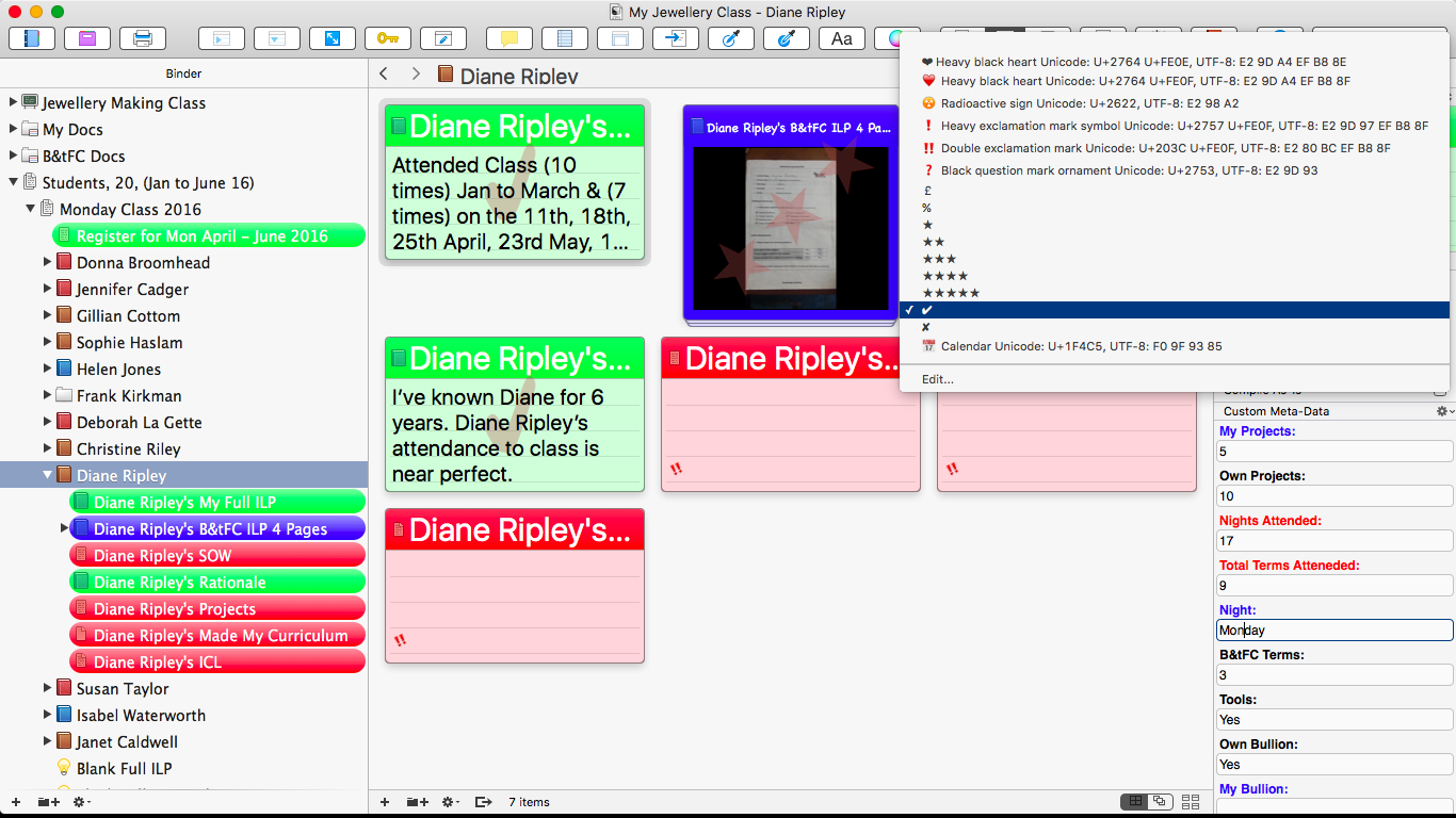
I’m trying to configure this Amber, I’ve sussed out how to get Unicode Glyphs in as status stamps, but can’t alter the size as you have done, The “Tick” has sized up but the “Double Exclamation Mark” hasn’t, or any of the others that I have put in as Status Stamps, any tips?
Thanks in advance
Mark
Status stamps will be fit into the diagonal of the card shape, with the font size being adjusted as necessary to do so. Extremely long status entries such as the ones I see in your menu, will have the font shrunk down so small you wouldn’t be able to read it on cards that size. It looks like the special characteristics of the symbol allow it to be seen even though the rest of the status text has become invisible.
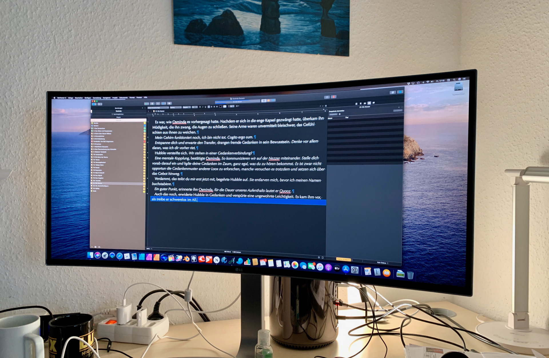
Hmm, one of these days I’m going to get one of those curved monitors! 