I am writing my thesis now and I have a number of diagrams. I firstly inserted them in Scrivener and adjusted the size as 800*500, It looks perfect. However, when I compiled my file into word, the inserted diagram seemed too large to fit into Word. I need to resize the picture again in Word. It is a little bit problematic as I have many diagrams. Anyone knows how to control the size of the inserted pictures in Scrivener in order to make them look perfect in word file?
The best way to do this is to figure out the widest your images should be in points, given the intended print settings, and then never exceed that. For example, a typical US Letter with 1" left/right margins (as it looks like you’re using) would be 612 points wide as paper, and minus the margins (144 points total) that would be a maximum of 468 points.
Once you know that, you want to then create your images to that width, at the DPI needed for the print job. So commonly that will be 468pt maximum at 300 DPI. With the images properly scaled from the start, you just drop them into Scrivener and leave them alone, no matter what they look like in the editor. That’s going to be the best and most professional looking result—particularly if you are generating the diagrams from a scalable source.
When you mess with the slider in any word processor you are in effect changing its DPI by adjusting how wide it should print regardless of whether it has the pixels to support that width. This might result in a loss of quality when printed, or a case where every image looks slightly more or less crisp than the images around them. This is going to be especially true for images with text in them. Using the slider means the text will be different sizes from one diagram to the next, merely because one diagram was a bit wider than the other—and text is always better printed at the precise scale the font was rendered for, rather than taking a 12pt font and shrinking or expanding it as pixels.
Best practices aside, in your case specifically, you’ve declared an image that is around 11.11" wide (800 points)—wider than the paper itself most likely. It looks like Word is compensating for that by reducing the image to the width of the paper, but then also continuing to offset it by 1" on the left, resulting in a bit of cropping on the right. You can kind of even see things are not going to go well in Scrivener’s preview, which isn’t WYSIWYG in terms of paper layout, but look at how far over the image goes against the text around it. The text wraps at the words “we further” on the first line in Word, which is about the halfway mark for the image.
It also looks like your image has some margin padding as pixels within it. I personally find it easier to crop that stuff out. The image can more easily be worked into the maximum width for the text column without breaking the layout.
Many thanks for your suggestions. Previously I did ignore the pixel thing to format my diagram, which may be overqualified for Word print. Yet there is only one question, why it is 468 pt at 300 dpi? 468 pt is for 72 dpi (6.5in72=468), isn’t? should it be 1950 pt (6.5in300=1950) at 300 dpi?
Regarding to my previous post, I think I mixed up the pixel with points. At 300 dpi, the pixel is 300*6.5 in=1950, the point would be 1950/(300/72)=468pt.
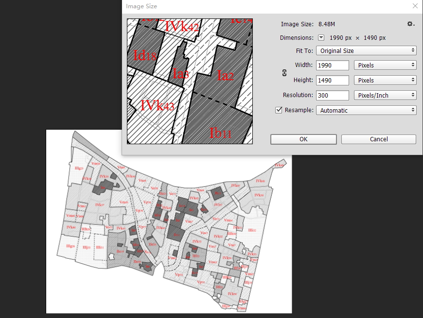
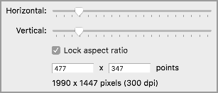
However, when I adjusted my picture in Photoshop to 1990 pixel at 300 dpi, the point of this picture in Scrivener is 798 instead of 477.6 (1990/(300/72)). The image is larger than previous one. I don’t know where it went wrong.
Yeah exactly, or I would more simply put it that a point is a fixed unit of measurement used in desktop publishing to represent 1/72nd of an inch. Nothing more, nothing less. When we say an image is 468pts wide, we could also say it is 6.5" wide.
Here is what I’m getting on the Mac in Scrivener:
As for what the Windows version is doing, I’ll have to check with someone that knows more about the current status. It could be what I was saying before is only pertinent on the Mac—that on Windows there is no inherent regard for the original scale of the image. Clearly that seems to be the case, since it is resized to 180 DPI on drop.
An issue I have with creating different sets of images depending on the desired size/resolution, is that this means having to multiply them for the number of channels the document will be then output.
Higher resolution for print.
Medium resolution for a web page read on a desktop computer.
Lower resolution for an ePub read on the small screen of a Kindle.
It can become unmanageable, and multiply the possibilities of errors. To be further multiplied for the number of extracted details you will have to make.
The project compiled from Scrivener to RTF is a bit different. Some of the images are not resized, some have a strange horizontal resizing (but no change on the vertical axis).
I didn’t resave, since in any case I wouldn’t want to do any mass-editing on the compiled document.
Yes, I already started experimenting with replacements for images (and other elements, like cross-references). This is something that Scrivener deals with very well.
However, I did some tests, and the image with more pixels looks better than the one with less pixels, whichever the output channel.
Even with a lower-resolution output like an ebook reader or a computer display, it looks like the image with more pixel is effectively downscaled by the reader.
In a web page, an image downscaled by a raster graphic program looks much worse than the same image with double the pixels, resized by the browser’s rendering engine.
This would suggest to use as high the resolution as it is convenient, even if the output channel wouldn’t apparently require it. What is shown doesn’t seem to be just a 1:1 representation of the image file content.
That’s what I would expect. More information is better. But it also makes for a larger file. Whether the tradeoff is worth it is up to you as the author/publisher.