I was completely unaware that the little orange icon did anything, or what its significance might be, despite multiple years in the forum. While I’m glad that this functionality is available, i’d prefer the explicit text link, please.
Reset your browser cache. Probably, like me (I use Vivaldi) there’s an inherited CSS that’s giving you dark text on a dark brown background.
Mark
I wish. I’ve tried it on multiple browsers, reset my cache on each of them, and was seeing the icon earlier. Nothing now. ;(
Ok, my point 3 is now resolved - the top buttons are now functional. 
However, the other two points are still outstanding - to show you what I mean about the small text, here are two screenshots:
- the first shows the size of font when composing (it’s a bit faint, but at least it’s large)
- the second shows the size of the text after posting - see how ridiculously small it is?
Also, a bottom button to return to the forum index seems to be a popular ask…


I’m not sure what that is referring to or where it would fit. I never used a text link or had any awareness of one.
It’s on the upper left. ![]()
From which URL are you seeing this, and so that I know what you mean, by “unread posts icon” do you mean the large circular thread status icon on the left?
I am seeing nothing like that myself. As I mentioned earlier, for me the font is quite large by default. I actually zoom our site out down to 80%. Here is what it looks like at 100% though:

Notice how the font is a completely different weight and size. Are you using something that changes the appearance of sites? It should be, I think, closer to what you see when you are composing. It would help to know what browser you use.
Here’s a Stylish theme if you want to use it:
@-moz-document domain("literatureandlatte.blinkio.co.uk"), domain("literatureandlatte.com") {
html {font-family:Helvetica, Arial, sans-serif !important;}
textarea { font-family:Helvetica, Arial, sans-serif !important;}
.common-questions__listing h3{font-family:Helvetica, Arial, sans-serif !important;}
.subnav li a:after{font-family:Helvetica, Arial, sans-serif !important}
.subnav li.subnav__buy-now a{font-family:Helvetica, Arial, sans-serif !important}
.subnav li a:active,.device-desktop .subnav li a:hover{font-family:Helvetica, Arial, sans-serif !important}
.subnav li.subnav__download a:active,.device-desktop .subnav li.subnav__download a:hover{font-family:Helvetica, Arial, sans-serif !important}
.subnav li.subnav__buy-now a:active,.device-desktop .subnav li.subnav__buy-now a:hover{font-family:Helvetica, Arial, sans-serif !important}
.subnav li a{font-family:Helvetica, Arial, sans-serif !important}
.common-questions__listing__section--open h3{font-family:Helvetica, Arial, sans-serif !important}
.features__icons h3{font-family:Helvetica, Arial, sans-serif !important}
.forum #viewprofile .details dt,.forum #viewprofile .profile-details dt{font-family:Helvetica, Arial, sans-serif !important}
.accordion__title {font-family:Helvetica, Arial, sans-serif !important;}
.text-filter {font-family:Helvetica, Arial, sans-serif !important;}
strong { font-weight: bold !important; }
.forum .forumtitle, .forum .topictitle, .forum li.header2 dt, .forum li.header2 dd { font-family:Helvetica, Arial, sans-serif !important; font-weight: bold; font-size: 1.1em; }
}
Yeah I have it on the list for them to look at. There are a billion links in the default skin and so naturally people are going to find the ones they prefer and forget the others. I’ve never even be cognisant of that link since I hit Home when I’m done with a thread. That works no matter how far into the thread you get. ![]()
Hmm, I thought we had them put those back in—I even see the very top level has a place for that under the search bar. So yeah that should be in.
By the way I’ve merged this thread with the other one. It doesn’t really make sense to be discussing forum feedback in two different threads—sorry for the confusion though as that process interleaves the conversation a bit!
Thank you soooo much! This makes the site much more usable for me!
Ok, the text size thing now seems to be resolved, though I echo what others have said about it being “thin, faint and spidery”. A meatier font would be preferable, don’t you agree? Or the same font we had before?
Can we have the forum index link back at the bottom of topics please? The natural tendency is to read the latest (unread) posts, which automatically leaves us at the bottom of the page. It was so easy to just click there to go back to the index, without having to bounce back to the top of the page to click. (Sure, I could just “Goback” in my browser, but that wouldn’t clear the ‘unread’ colour on the left of the index list).
Please, pretty please?
(I’m using Safari 9 in OS X 10.9.5. I’ve put the Stylish code in but I suspect the ‘spidery’ font is already Helvetica, or a variant thereof? I could edit the Stylish code, I suppose - would it work if I replaced every reference to Helvetica to (e.g.) Georgia?)
It used to appear to the left of the upper page list once you’d tapped on the thread. On small screens, it appeared instead of the page list, which only appeared at the bottom.
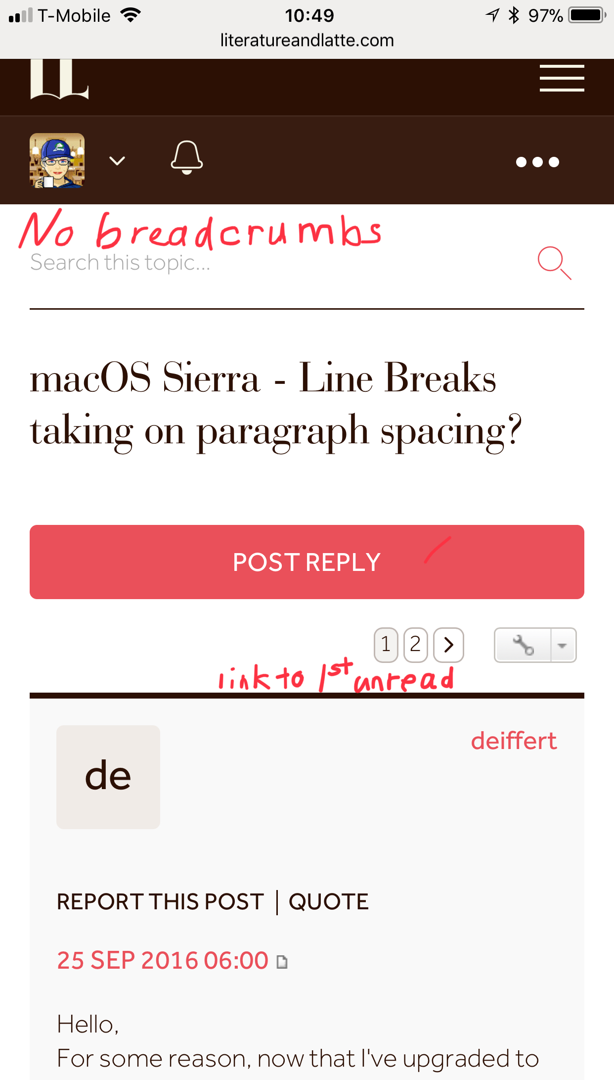
I usually use the forum on my iPhone, but now I must use either my iPad or my Mac because so much is missing from the small screen. Bread crumbs do not appear on my iPhone! And yes, I’ve reset the cache. I’m attaching two marked-up screenshots to illustrate. Thanks for listening.

Ahhh, iPhone/Pad/etc. Sorry I think you said that but it didn’t click and I’ve just been looking at the site on my Mac. Thanks for the annotations! I never really noticed those links before, I’ll put them on the list for them to take a look at.
Maybe those tiny little click bugs could be a little less grudging – finnicky to target with a mouse, hopeless with a finger. That on is just like the tiny post links to tthe right by the last poster’s handle. How many times have I ended up on the user profile page instead of the last post?! (It is a crap shoot on a touch screen, for sure.)
Anyway, I do have a sense that both of these mini dog-earred doc icon links are now somewhat out of keeping with the new design – far too grudging in size and space. The new forum style grants more space to emptiness, and a more open and forgiving way to incorporate these two links could be worked up.
Update: Like Silverdragon, I never had any inkling that orange icon did something!
Yeah, I should rework my avatar, because it is all black with transparency – hence now showing up black on very dark brown on that bar. or rather, not showing up!
I don’t browse much on a phone, but I’ve always made heavy use of zoom when doing so as I don’t care for mobile-only designs by and large, and desktop designs demand more precision in general. So I just flick zoom on the thing and you can’t really miss it then.
As for with the mouse—I tend not to I think. I activate most links with the keyboard. I type in the first few letters of a link I want to go to and press return—and for stuff like that where the thing I want to activate is next to the link, I (shift-)tab to it.
Like right now. I’m not going to reach for the mouse and click “Preview” or “Submit”, I’m going to hit Tab,Tab,Space.
Sorry, my opening line there was really a rhetorical flourish. I wasn’t really wondering, I admit. ![]() Rather, I meant, in high rhetorical style, to imply that ‘those tiny little click bugs are far too grudging’. And as the post went on to say, maybe those tiny bits are no longer quite in keeping with the new style.
Rather, I meant, in high rhetorical style, to imply that ‘those tiny little click bugs are far too grudging’. And as the post went on to say, maybe those tiny bits are no longer quite in keeping with the new style.
I should have spoken more straightforwardly on such a busy day.

As noted before (I think), I already have the request to put post-thread navigation links on the list.
The font isn’t Helvetica, it’s Effra. The previous forum skin uses Helvetica, so if you were comfortable with that you should find it works okay.
Ioa, how does a user get their browser to load that theme?
I tried loading it as a style sheet in Safari’s preferences, but that didn’t work, even after a relaunch and a reboot.
Firstly you need the Stylish extension installed into your browser. Secondly, I found that with the Safari version of that extension, the outer two lines of my code snippet should be removed: that is the part referring to “mozilla” stuff on the first line, and then the very last curly bracket.
I didn’t realise Stylish is an extension. Appreciate your help.
Thanks.
Now it works! Much better - thanks. ![]()